This is where MPD can help out. Traditional data sources like surveys and censuses show where people live and/or work, but this information might be outdated, consist of one location point only, and not cover movements to other places or changes in movement patterns within the week, at weekends or in different seasons. MPD can show how many people are in the area and monitor their movements between area units, with hourly and village-level accuracy. Within the BuildERS project, in addition to the use of near real-time MPD, Positium has now explored the use of historical MPD for crisis management. MPD has proven to be highly valuable information in the pre-crisis phase.
One of the project objectives for Positium was to create an MPD-based dashboard for visualising peoples’ whereabouts, mobility flows and secondary homes information that could be used for crisis management. The dashboard:
is useful for analysing events in retrospect – the behaviour patterns before, during and after disaster scenarios can help plan communication, traffic flows, and resources.
has been verified by end users for its reliability – the hourly view from MPD matched real-life mobility during a storm.
is useful for making risk assessments and more accurate plans – it gives more accurate input to shelter and evacuation route planning.
can be used to plan transport corridors for hazardous materials or military training routes to eliminate contact with large population volumes.
is useful for both national and regional planning.
displays de facto data that is more exact and accurate than static databases and registries – registries do not include information on commuting between different places and only have data about registered, not actual addresses. MPD provides more accurate insights here.
Within the BuildERS project, Positium had two case studies: one in Indonesia, exploring near real-time MPD for finding tourists in the area during crises, and the other one in Estonia, exploring the possibilities of using historical MPD in the preparation phase of crisis management.
Estonian case study
Due to its geographical location, Estonia is not prone to many natural disasters; still, seasonal storms and blizzards can cause problems here, too. As Estonia is known as a strong IT country, there is also a risk of cyber attacks. The risk of damage is even greater considering that, to disguise them, cyber attacks could also be made when natural hazards (weather extremes, fires, floods) hit. How to reach people in need when all systems are down?
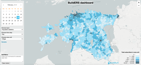
In collaboration with the Estonian Rescue Board and the University of Tartu, Positium built a dashboard for more accurate risk assessments of areas and buildings, and for predicting evacuation needs prior to crises for better resource planning as well as for forecasting movement behaviour during crises. The dashboard shows historical MPD. It visualises:
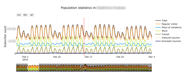
the number and type of people usually present in an area (people living, working, or regularly visiting in the area, domestic tourists, foreign tourists);
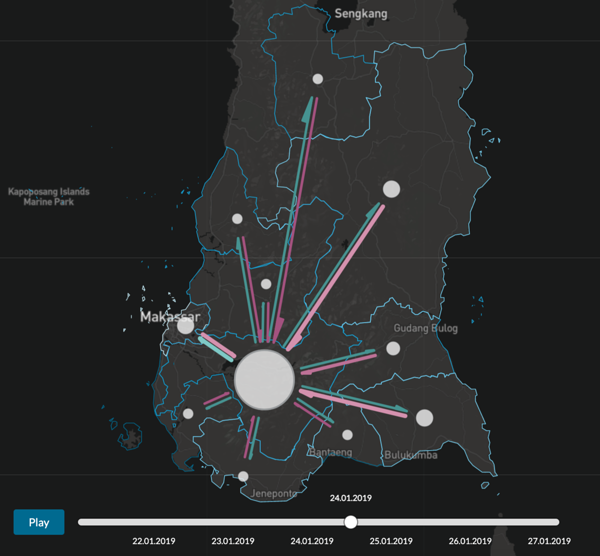
the direction and number of movements between different areas;
the number of people in the area who have a secondary home (in addition to the primary home) that they could go to in the case of an evacuation, and the distance of the secondary home from the chosen spatial unit;
daily, weekly and seasonal volume changes and movement patterns that other databases cannot show.
End users considered this dashboard to be a highly valuable asset in the pre-crisis phase where they learn from past crises and events. The Estonian Rescue Board is currently doing risk assessments for flood areas, but they are struggling to get accurate information on population counts in different areas and are asking municipalities for this kind of information. This takes a lot of time and resources, and, unfortunately, the municipalities do not have accurate information from recent years either. Therefore, this dashboard is exactly what Estonian Rescue Board needs – it helps them save time, as well as human and financial resources, and helps to make better risk assessments for different areas, buildings or danger zones.
Indonesian case study
In Indonesia, the sudden onset of natural or man-made disasters puts visitors and tourists at a particularly high risk. As Indonesia has a long history of thousands of disasters, they already have systems in place that help to prepare for, react to and recover from crises. One of these systems helps locate tourists with the help of a mobile application, but this needs to be downloaded and filled with information by the tourists upon arrival. If this is not done by the tourists, no help can be provided from this source.
There are also systems that help identify how many people were found on the ground living, injured or deceased after a crisis. All of the systems provide insightful information, but also come with some limitations. Thanks to the dashboard newly developed by Positium for the BuildERS project, we are now able to fill in the one missing gap – the number and origin of tourists present in the general area affected by a crisis. The broader the view the ministries, embassies and rescuers have, the better crises can be managed.
When the dashboard was validated in a focus group discussion involving ministries, embassies and rescue organisations in Indonesia, the new dashboard was found to be most useful when combined with other, existing dashboards. Not only does the dashboard show the number and origin of tourists in an area, but it can also show mobility into and out of the crisis area, which helps to assess whether the information issued by the authorities reaches vulnerable groups well (considering a time frame of near real-time to 24 hours). If a significant number of people is not moving away from the area, it could indicate that the necessary information does not reach vulnerable groups in time. Information about the number of tourists in an affected area can also be used in crisis communication with embassies to let them know how many residents from their country were in the area. Given the positive feedback and high interest from the key stakeholders, we look forward to continuing this excellent collaboration to improve disaster resilience in Indonesia.
Would you be interested in learning more about mobile big data and Positium? Let's talk about what mobile big data can do to help your organisation make decisions based on population mobility.
.png)
_block.jpg)


