The #30DayMapChallenge made its return in November 2020. The challenge, originally launched on Twitter in 2019 by Topi Tjukanov, brings together map enthusiasts from around the world to showcase their work and explore the plethora of options in map-making. In that first year, we went all out and submitted a map for every day. In 2020, however, we took a different approach and explored new map-making tools and techniques. Ivan Vasilyev, Data Specialist from our Methodology Team reflects on his experience with the challenge.
Day 2. Lines.
The map shows the mobility of one person over a six-year period, separately for weekdays and weekends. The source data used for the visualisation is call detail records (CDRs) of a volunteer who agreed to provide this data for the Mobility Lab of the University of Tartu. Initially, the data was in a text format showing the time of an activity and the coordinates of a related mobile network antennae. To construct the lines, the events were ordered by time, and every point was connected with the following one in a chronological order to form a simplified movement trajectory. Then, based on the time of the event, weekdays and weekends were separated. These data processing steps were done in PostgreSQL with a PostGIS extension.
After the data had been processed into a suitable format, all further steps were completed in QGIS. As with any creative process of data visualisation, many attempts were made experimenting with layout, main and background colours, and graphic effects. Although QGIS is widely used for common GIS workflows and map creation, its tools for graphic design are somewhat less known. It has a powerful rendering engine which allows customising the look of individual features or layers not only by colour and transparency, but also with a rich variety of effects like glow, colour addition and subtraction, shadows, halos, and many more.
Day 4. Hexagons.
This visualisation shows the elevation of Estonia as a hexagonal grid. This is an example of the use of the H3 Discrete Global Grid System (DGGS) created by Uber. The first H3 resolution (resolution 0) consists of 122 cells (110 hexagons and 12 icosahedron vertex-centered pentagons), referred to as the base cells. DGGS is an alternative spatial data model and reference system, which is gaining more and more popularity. In the case of Uber H3 DGGS, the surface of the Earth is subdivided into a hierarchy of hexagonal grids with a range of resolutions from 122 base cells with an area of 4.2 million square kms up to millions of cells with a size of 1 square m. Each hexagonal cell has a unique index which allows to unambiguously address any location on the Earth.
To create the visualisation, the elevation data of the Estonian territory from MERIT DEM converted into a raster format was loaded into an H3 grid at a resolution where a cell’s area is 0.1 square km and then aggregated into 3 coarser resolutions. Data processing and visualisation were done in Jupyter Notebook using H3, Geopandas, Rasterio and Matplotlib Python packages.
Day 5. Blue.
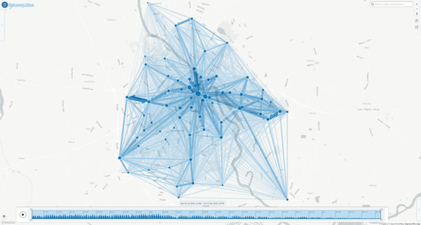
This illustration is a flow map showing ride activity in the Tartu City Smart Bike Share system over a half-year period. The data was gathered from one of our projects with the City of Tartu. The illustration shows a screenshot from the WEB-application Flowmap.blue, which allows visualising any mobility data in an origin-destination form as an interactive flow map. The application greatly simplifies the final steps in mobility data visualisation.
Still, for this visualisation, data pre-processing required some effort when transforming text files containing raw data on rides and the locations of stations into the format required by Flowmap.blue. This part of the process was done using the almighty Pandas Python package. The interactive version of the map is available here.
Day 10. Grid.
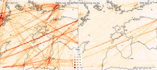
Flight intensity over the Baltics during one day in the pre-COVID and COVID world. Both the data processing and visualisation parts were quite challenging in creating this map. The source data comes from OpenSky Network, an open-source data platform which collects air traffic data in real-time and provides it via a web API or access to a historical database. Data for the chosen dates and the area of interest was extracted from the OpenSky database using the Traffic Python package, developed specifically to conveniently manipulate air traffic data. Then, millions of flight tracking points were aggregated into the Uber H3 hexagonal grid and the number of unique flights per hexagon was counted.
The map creation part was done in QGIS. Not a very striking, but nevertheless quite an exciting feature can be seen in the legend – hexagons as legend symbols. QGIS has a great set of tools for creating map legends in a convenient and flexible way, this is one of the lesser-known functionalities. Using simple formulas, it is possible to create any desired shape of legend symbols.
Day 11. 3D
This animation (above) is made as a screen recording from an interactive web application Kepler.gl. The visualisation shows the mobility of people between Tallinn, Tartu, and all other administrative units in Estonia over a one-month period. The visualisation is made based on anonymised and aggregated mobile positioning data from University of Tartu Mobility Lab. Custom Python scripts were used to create the origin-destination dataset and adjust it to the format understandable to Kepler.gl. Kepler.gl is a great open-source web-based tool for spatial data visualisation and interactive exploratory analysis. After data for this visualisation had been prepared, it took less than half an hour to visualise it.
Day 15. Connection.
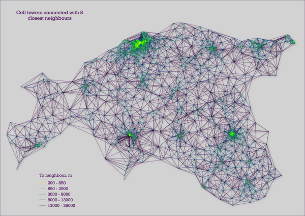
This visualisation was created accidentally during daily work on a task. The map shows network antennae locations connected to their eight closest neighbours by lines which are colour-coded based on the distance parameter. This is not a representation of a mobile operators’ network as this is a sample of antennae’s and all locations are shifted in random directions. The visualisation itself was made in QGIS again, utilising its rich rendering functionality.
Day 22. Movements.
Above: One day of Tartu Smart Bike Share rides. Greens – rides to the most popular bike station, reds – rides from the most popular station. Ride trajectories are calculated based on an origin-destination dataset with Graphhopper. Visuals made in Kepler.gl
The visualisation shows bike rides registered in the Tartu City Smart Bike Share system for one day, and it was made using the Kepler.gl tool again. The data was gathered from one of our projects with the City of Tartu. The initial dataset is already familiar from the Flowmap.blue application: text files with ride data and information on the location of bike stations. The data processing part of this visualisation was by far the most complex and demanding one yet. To convert origin-destination pairs of rides to into routes, the Graphhopper routing engine was used. It allows generating a route between two points using the OpenStreetMap’s road network. Several predefined sets of parameters exist in the software which enable defining the desired means of transportation. For this visualisation, the bike profile was used, so that bike lanes and pedestrian roads were more likely to be included in route generation rather than highways.
The next challenge was to convert the generated routes into a format appropriate for Kepler.gl . The format for this type of animation in Kepler.gl is a custom construction of a geojson-like structure, which required quite a lot of Python scripting. After data processing, the visualisation stage took just a neglectable amount of time – around 15 minutes..png)
.jpg)


